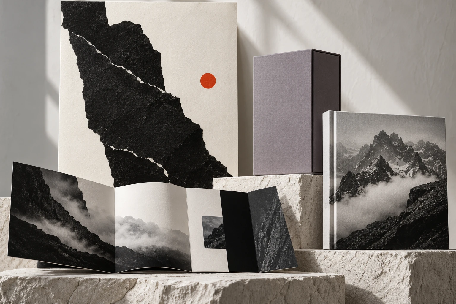
A quiet perspective
A concept publication on the cadence of reading—where paper, imagery, and space give every spread its own breath.
- PROJECT TYPE
- Self-initiated study
- DISCIPLINE
- EDITORIAL / PRINT
- EXPLORATION
- Cover & spreads / Editorial grid system / Image sequencing
How can editorial design invite deeper understanding and a slower pace?
Approach reading as a choreographed sequence. A disciplined grid establishes underlying order, while shifts in image scale, typography, and negative space create cadence and pause.
Some stories
call for a slower pace.
The cover invites; the spine opens. Imagery, typography, and silence unfold into a cadence you can naturally follow.
A quieter
kind of
clarity.
01 — A POINT OF VIEWGive an idea
the space it deserves.
Thinking in spreads
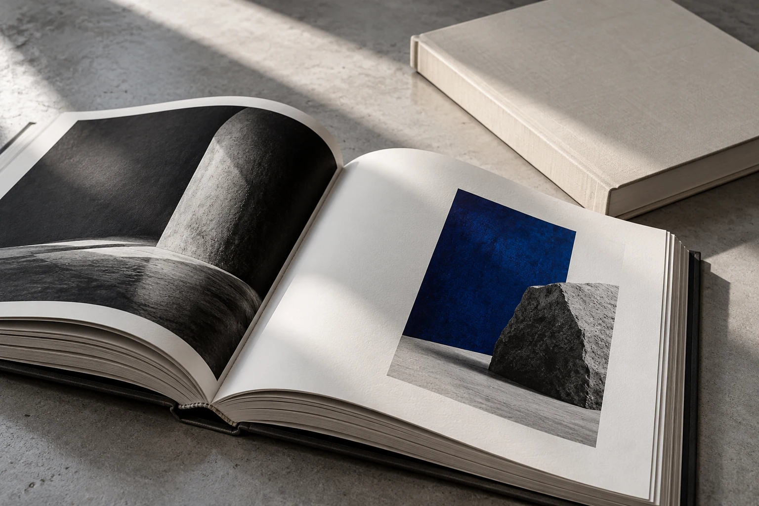
One page poses a thought; the facing page answers. Image and text sustain a continuous dialogue across the gutter.
The language of paper
Tactile paper stocks and muted tonalities reinforce the editorial voice, aligning material form with subject matter.
Quiet orientation
Folios, chapter markers, and captions adhere to a consistent system so readers always feel effortlessly oriented.
A self-initiated concept study. Material scenes incorporate AI-assisted imagery; interactive components illustrate the underlying design rationale.
Exploring a similar direction?
START YOUR PROJECT BRIEF ↗